
The Colorful World of our Childhood: Frutiger Aero
Nostalgia is more accessible than ever before. For any generation, it’s all right there in your pocket. Images, videos, music – all incredibly easy to relive whatever era you want. Old visual styles and aesthetics always seem to resurface in some form – the 80s and 90s influencing pop culture today, or the resurgence of Y2K fashion seen on every street in the five boroughs. One of the newest aesthetic resurgences that has blown up all over TikTok, YouTube, and more, is actually from this century.
Everything about tech now is sleek, seamless, “clean.” Apple in 2024 markets an elegantly elevated, lightweight, minimalist experience. Software is visualized in UX packages of flat, often flavorless icons. It’s compact, cohesive, and corporate-friendly. Most companies have rebranded to this look. Yet tech aesthetics used to be so visually rich. People around the world are reminiscing about the future we were promised: Frutiger Aero. And they desperately want it back.

This is an example of Frutiger Aero, popular from roughly 2004-2013 in advertising, UX design, and other types of media. As someone born in 2001, this is, in other words, what my childhood looked like. It’s a world of glossy textures, vibrant colors, and the combination between technology and nature. It represents a sense of giddy optimism, as if a harmonious coexistence between the earth and the ever-growing tech industry would result in a bright, utopic future. When this style was popular, some referred to it as Web 2.0 Gloss, yet the term Frutiger Aero surfaced in 2017 when Sofi Lee of the Consumer Aesthetics Research Institute noted the use of the Frutiger font family in this aesthetic, combined with the Windows Aero design language by Microsoft in its UX design of the early 2000s.
Skeuomorphism has a big role to play here too, defined as digitally designing items to resemble their real-world counterparts. Think of the original iOS application icon designs, or maybe the designs on the apps of an old flip phone you may have had as a kid. The Notes app looked just like a notepad. The camera app had a hyper-realistic camera shutter icon that loudly clicked like an analog camera. The Voice Memos app was just a big microphone. And of course, the iconic YouTube app that came packaged with Apple products looked like an old box TV. In Frutiger Aero, nothing looks like a minimalist representation of a real-world object. Frutiger Aero puts real-world objects front and center.
In 2004, the Y2K aesthetic was on its way out and, although similar to Y2K, Frutiger Aero was about to really about to take off into a world of its own, largely due in part to how much tech companies embraced it. In the span of just a few years, Windows operating systems, Apple’s marketing (and soon, the iPhone), video game consoles like the PlayStation Portable (PSP), Xbox 360, and of course Nintendo’s iconic DS and Wii, all used Frutiger Aero design. For Gen Z especially, and younger millennials, who grew up during the release of all of this tech, it’s how we first came to really perceive technology and perceive the internet as a whole. It was futuristic and optimistic, before widespread commercialization eroded most of the novelty and raw excitement of logging onto the family computer to surf the web, emailing a new picture you took on your flip phone, or playing Wii Sports with your family on a sunny Saturday afternoon.
Some video games even took place in glossy, utopic, Frutiger Aero dreamscapes, notably Mirror’s Edge in 2008. This free-running, parkour and combat game was widely popular and I spent so many hours getting lost in the beautiful world Electronic Arts crafted. Some architecture and interior design even adopted a similar aesthetic, especially in corporate spaces, featuring bright, colorful, and futuristic design that brought a unique personality to physical spaces.
The recent Frutiger Aero obsession that began in 2022-2023 came as no surprise to me. We can all pinpoint a massive shift in UX design in 2012, when Windows 8 released and completely reskinned, and in 2013, Apple followed suit with the release of iOS 7. Since then, most brand design has adopted this corporate feel of flatter colors, minimalist iconography, and overall a less realistic, more distanced look. We could even get into the countless rebrands of iconic companies from legitimately unique wordmarks to bland, sans serif fonts and designs in favor of more easy-to-use branding, but that’s a whole other article. (Yet another article would be the erosion of the Global Village Coffeehouse aesthetic – think what Starbucks, Panera Bread, etc. looked like in the early 2000s compared to now).

Iconic brands and their wordmarks have lost so much character over the years in favor of logo scalability and overall readability.
Additionally, the associated sound effects and musical accompaniments that bring Frutiger Aero to life add a whole new layer to the aesthetic, found in the sound effects packaged in the Windows and Apple software, such as startup sounds and ringtones. With light, airy, and positive electronic tones, the musical trends of the time only deepen the Frutiger Aero nostalgia to create an entire sensory experience of what it meant to engage with technology and use the internet in the early 2000s.
What we can observe here is that aesthetics are all related, and there are often subgroups of prevailing aesthetics, or offshoots that are entirely different, yet still were from the same time period. When looking back on my childhood, I often reminisce through the lenses of these aesthetics, and the objects that embodied them. I think of my first phone before my parents trusted me with an iPhone: a slide-keyboard, “Pantech Vybe” phone, that had the perfect mix of glossy textures, natural backgrounds, and tinny, electronic ringtones. I think of the vibrant, peaceful games I played on my Wii, and later Xbox 360. I think of the exciting feeling of spending time in my elementary school computer lab, using old software like Rosetta Stone and UltraKey, writing stories in forbidden fonts like Comic Sans, in whatever color and size I wanted. I also think of my time spent off screens: the time I spent playing outside after school, the trips I took with my family, the late summer nights. I even think of the frozen yogurt craze of the 2010s (another thing my generation yearns for now, and thankfully 16 Handles is still going strong). It seemed like most frozen yogurt chains had a Frutiger Aero-esque vibe to their interior design, with vibrant colors, futuristic furniture, and playful accents all around. I’m obviously nostalgic for the memories, but I’ve only recently come to realize how these memories are shaped by how technology looked, how their user interfaces behaved, how the world felt.
And the way the world felt, that optimism of the future, coexisting peacefully with technology… I think we can all agree the world looks pretty different today than images like these:


And people are yearning for it. The “20-year rule” in fashion and aesthetics states that trends and patterns resurface after around a two-decade mark. Typically something falls out of fashion when it’s overused, but then, as people age, realize how much love they have for something. Frutiger Aero is definitely starting to get that nostalgic recognition. Some are fully adopting the skeuomorphic aesthetic on the most recent iPhones, using an app icon customizer called Widgetsmith.

Screenshot from a new iPhone in 2024, using old textures for the apps.
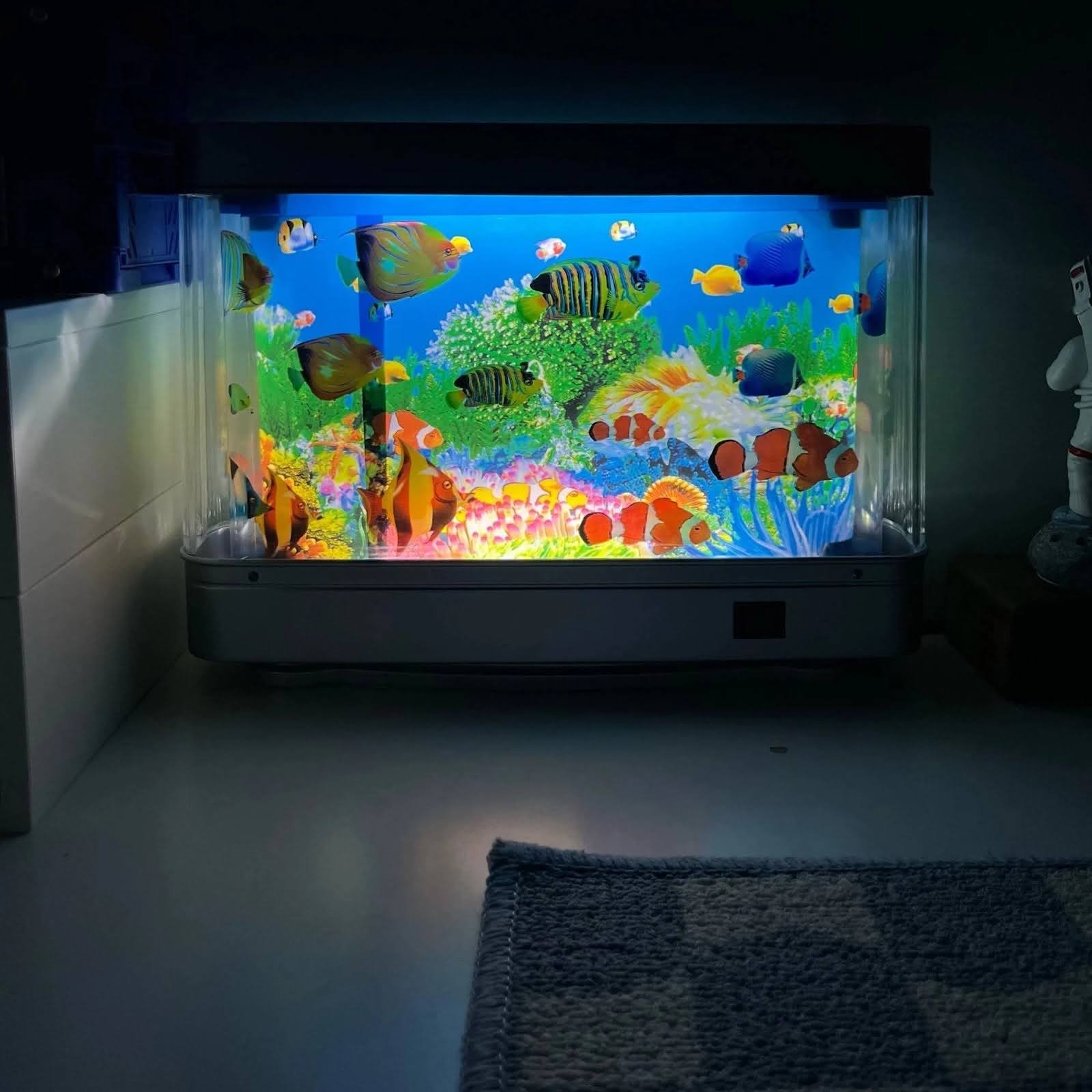
People are making TikToks showing off their bedside aquarium lamps, and I even have one of my own now, as a reminder of simple, childlike wonder.
After around a decade of dormancy, and two decades since its infancy, Frutiger Aero and skeuomorphism are getting young millennials and older members of Gen Z to reject the oversimplification and minimalism of architecture and design. Comparing 2004 to 2024, so much soul has been lost. The internet has become a hub of so much industry and capitalism – a far cry from the days of playful experimentation and naive optimism about the future. There’s an elevated standard and general idea now, almost halfway through the 2020s, about what looks sleek, what looks readable, and what constitutes a powerful brand identity, yet at the same time, our culture has been injected with so much visual sameness. Reclaiming Frutiger Aero and its associated aesthetics from our collective childhoods may be a way that our generation can inject more of a youthful optimism and joyous exuberance into how we engage with the internet and technology, and reshape the physical and digital environments we use every day.